The Do’s and Dont’s of Logo Design
When introducing your company or brand, the first thing people see and take note of is your logo. It’s the first window to understanding who you are and what you do.
Below are some of the dos and don’ts of logo design to keep in mind.
Keep it simple
The best logos out there are simple, clear and to the point. Some of the most straightforward logos are the most memorable, for example, Apple, Mcdonald’s, Mastercard, to name a few. Although they’ve evolved over the years, the simpler they’ve become, the more memorable they are today.
Don’t overdo it
Logos are generally small unless they need to be a beacon to your company’s whereabouts. When thinking of what you want from your logo, don’t overdo it with taglines or detail. Remember, less is definitely more.
Be Unique
First impressions are everything, so make it memorable with a unique logo. A unique logo will always be memorable, and who knows where that might lead.
Don’t follow the current trend.
What may seem like a new design trend will soon become outdated and replaced with another. And you’ll find yourself wanting a re-design soon after.
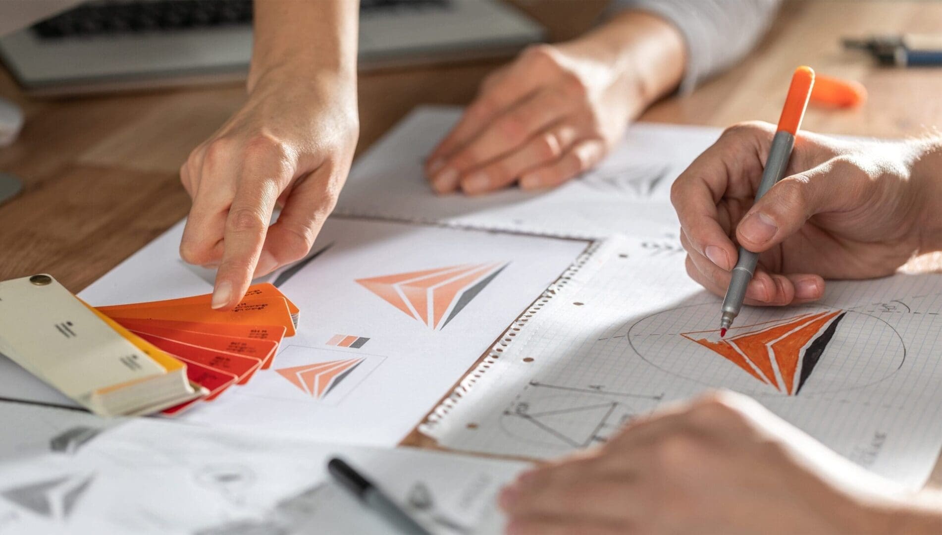
Colours matter
Every colour conveys and signifies a meaning or emotion. What do we mean by that, you may ask? Well, the colour blue, for example, represents meanings of trust, loyalty, sincerity, confidence, and stability, to name a few.
Did some logos come to mind?
It will do you well to research the different colours’ meanings and see which ones resonate with your company or brand.
Whether you have no clue where to start with your new logo, have a small concept idea, or know precisely what you want, Dorset Tech can be the team to bring your company or brand’s identity to life.
Take a look at our Logo Design page and see how we work and why we’re the right team for you.


